Modernize your PowerBuilder Applications
Ultimate Suite for PowerBuilder
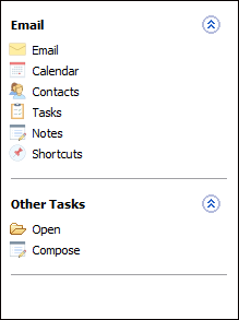
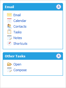
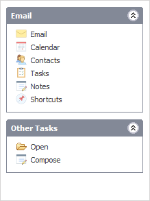
Windows Style Bar
The Windows Style Bar duplicates the look and behaviour of listbar commonly found in Windows applications such as the Control Panel.
Use this control to logically group application functions. Each group can contain links, labels and lines. Group headers can take on three styles, bolded background, collapsible or non-collapsible.
The Windows Style Bar comes with four built in themes and can be changed dynamically during runtime.
Implementation
//Open Event of window that contains the control
//Or the post constructor event of the userobject that contains the control
//Declare variable to hold parent handle
Long ll_parent

//Add first group to control with a blue header
ll_parent = uo_xplistbar.of_AddGroup('General', 'Mail.ico',
uo_xplistbar.SPECIAL)

//Add items to the group
uo_xplistbar.of_AddLink('Item One', 'Custom001!', ll_parent)
uo_xplistbar.of_AddLink('Item Two', 'Custom002!', ll_parent)

 //Add second group to the control (no image)
ll_parent = uo_xplistbar.of_AddGroup('Group Two', '')

 //Add items to second group
uo_xplistbar.of_AddLink('Item One', 'Average!', ll_parent)
uo_xplistbar.of_AddLink('Item Two', 'Custom005!', ll_parent)
uo_xplistbar.of_AddLine(ll_parent)
uo_xplistbar.of_AddLink('Item Three', 'Custom005!', ll_parent)