Modern PowerBuilder Controls
Ultimate Suite for PB 2020 Released
New Controls to Modernize your PowerBuilder Applications
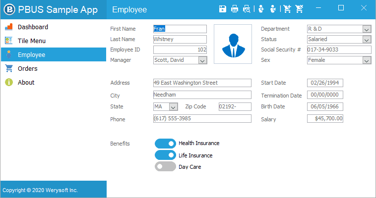
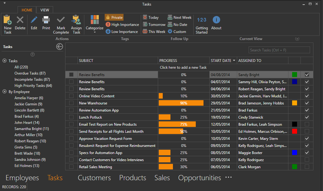
Ultimate Suite for PowerBuilder offers a wide range of modern controls to update the presentation of your PowerBuilder application.
Improve User Experience with new controls and
new ways of navigating in your application.
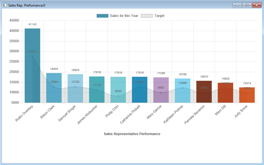
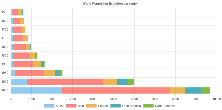
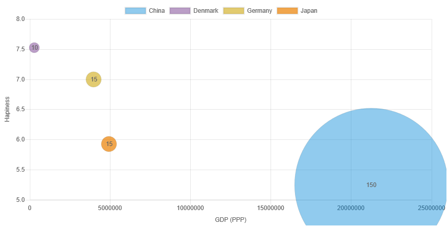
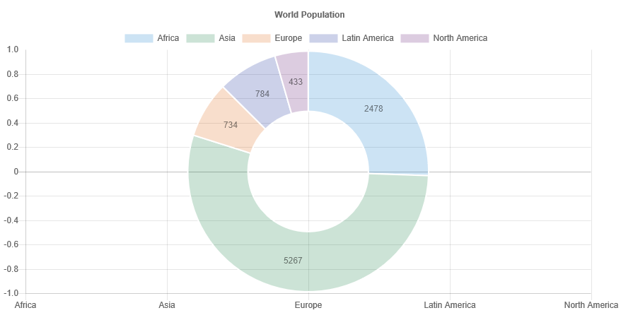
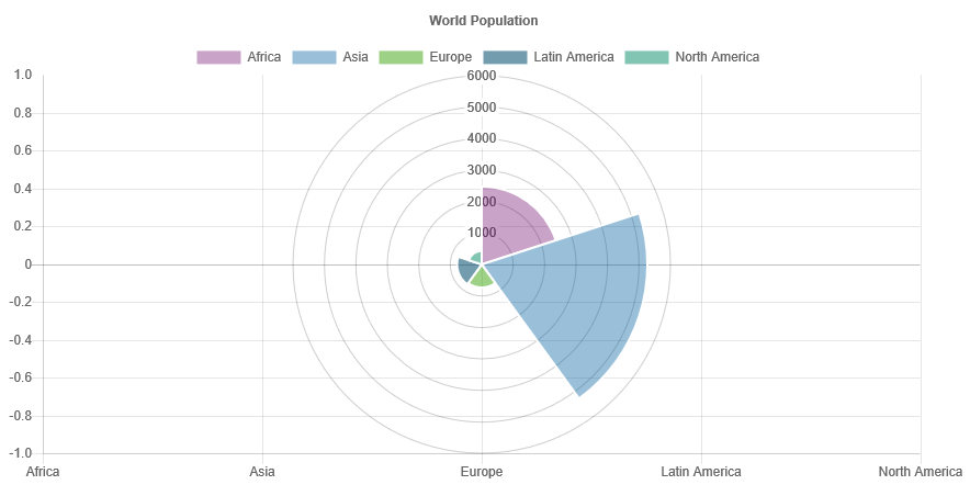
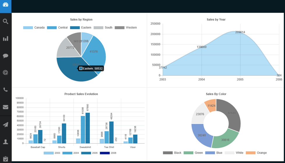
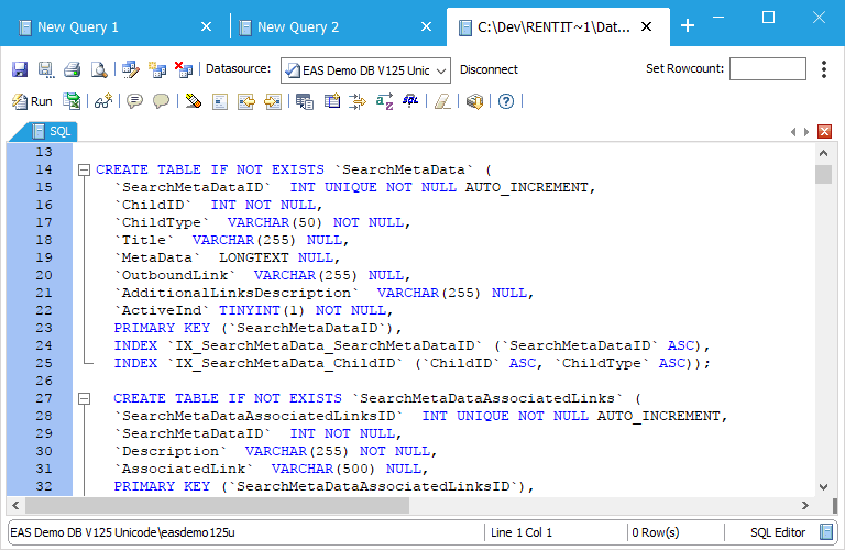
Animated Charts
With PowerCharts, Ultimate Suite for PowerBuilder offers a dozen types of charts and millions of customization possibilities to visualize your data.
Combine charts to build modern dashboards or implement drill-down features.
You can also include them in your PB reports to print them out.
Charts are based on Datawindows.
No need to code to create them.
Configure your charts with a painter and implement them with usual this.settransobject() and this.retrieve() instructions.

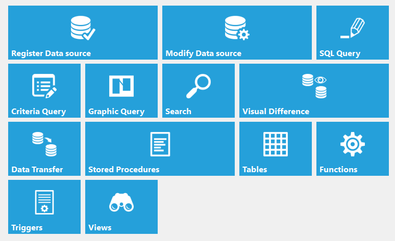
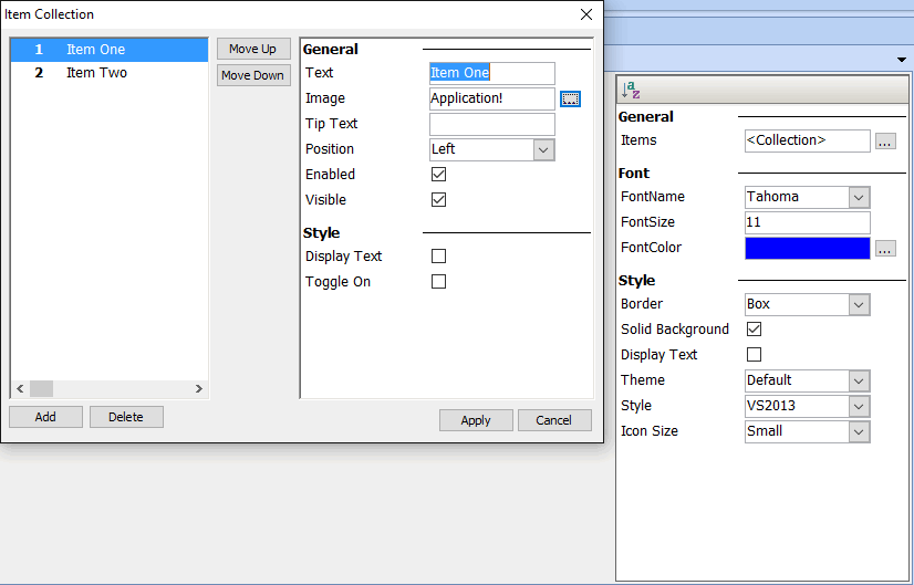
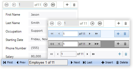
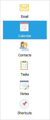
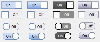
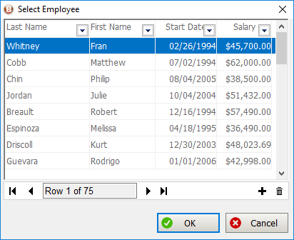
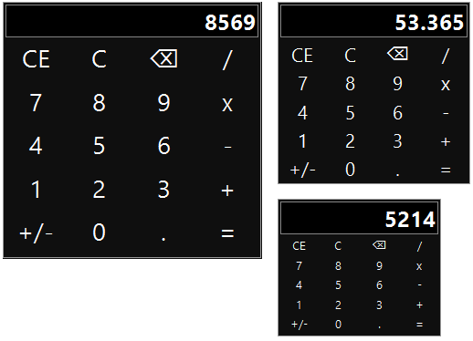
USPB 2020 New Controls
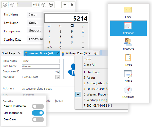
- Single Page Application
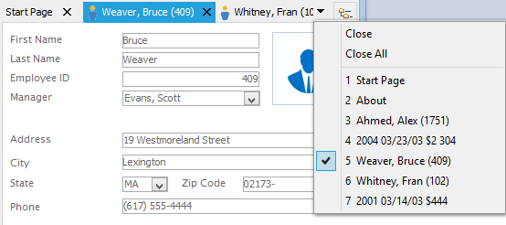
Single Page Applications display functionalities within a single window. 3 different different types of single page application are available. - Tabbed Caption Window
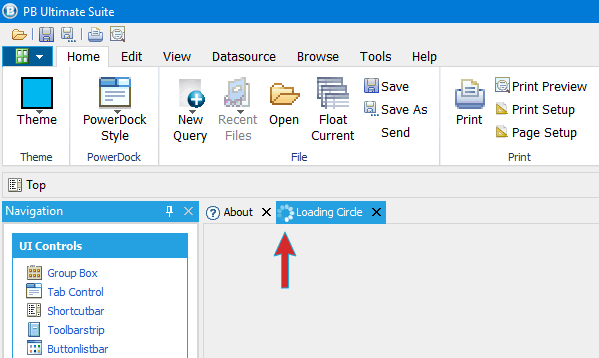
The tabbed caption window behaves very similar to most modern web browsers. Each opened window is displayed as a tab in the windows caption. - Loading Circles
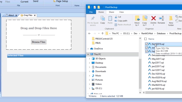
The loading circle continuously rotates indicating that a process is waiting to complete. This control can be placed anywhere on screen and in Docking controls, Tab Controls and Ribbon Menus. - Drag and Drop
The Drag & Drop component can be added to any window or user object to allow users to drag files into the application.
Coming Soon: GAUGE CONTROL
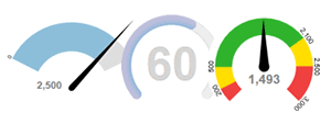
- Expected summer 2020
- Included with all USPB Editions
STAY TUNED!