20+ Modern PowerBuilder Controls
Ultimate Suite for PowerBuilder
Give a Modern Look to your PowerBuilder application
20+ Controls to Modernize your Application
Improve User Experience with a modern UI, enriched with new controls and new ways of navigating in your application.
Instant Facelift
Give it a fresh, updated look and feel with dozens of Built in Themes and Styles.
Legacy Apps
Quickly revamp Legacy Applications.
Modernize your Application Now
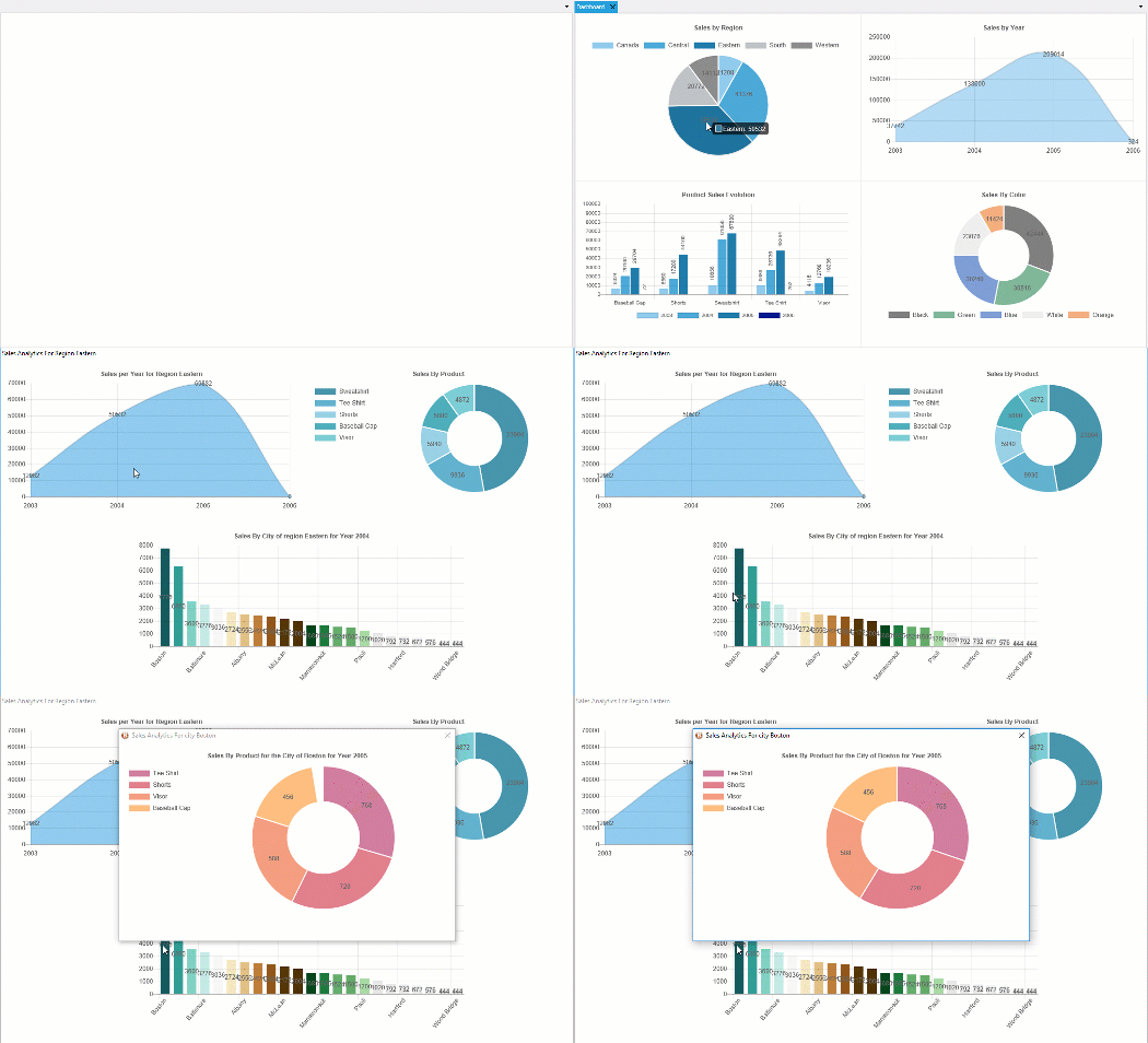
Animated Charts
Ultimate Suite for PowerBuilder offers a dozen types of charts and millions of customization possibilities to visualize your data.
Combine charts to build modern dashboards or implement drill-down features.
You can also include them in your PB reports to print them out.
Charts are based on Datawindows. No need to code to create them.
Configure your charts with a painter and implement them with usual this.settransobject() and this.retrieve() instructions.
Ribbon Style Menu
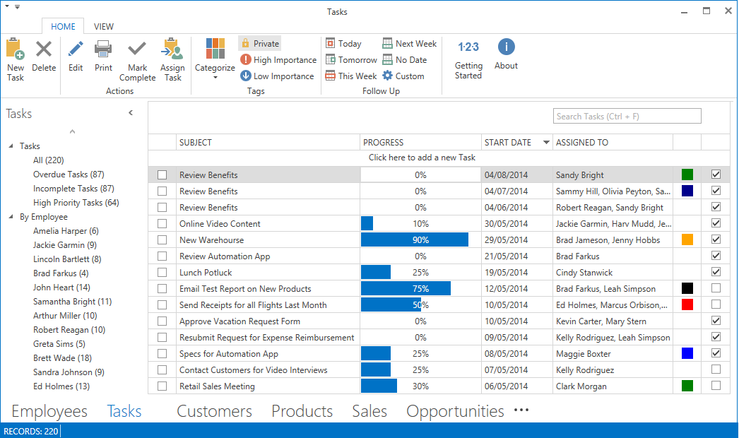
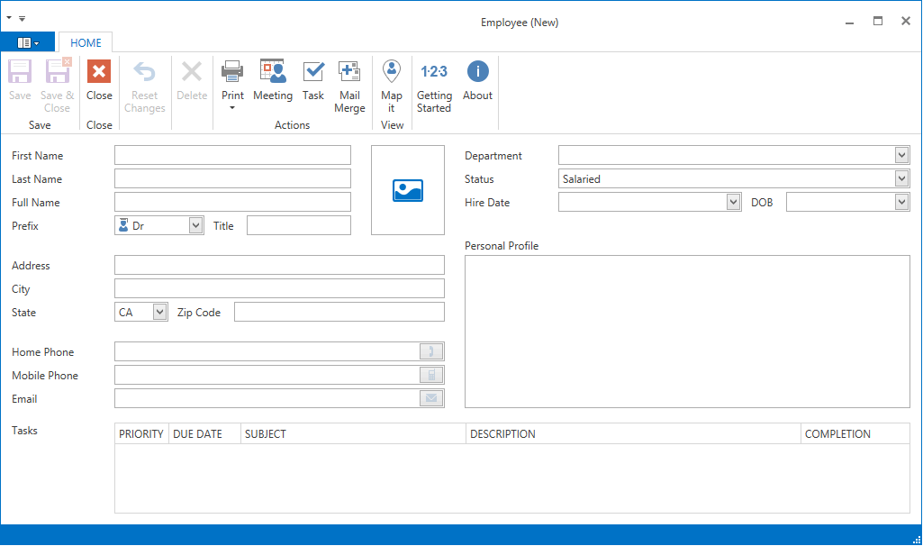
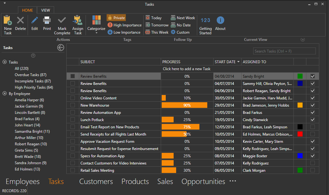
Ribbon Style Menu is a replacement for the PowerBuilder menu. It gives users a ribbon style UI.
With a few tweaks to your PB menu you can:
- Group relevant functions into tabs.
- Expose more functionality to your users.
- Move common functions to the Program Tab menu.
- Organize your menu items with large and small icons or use a drop down menu.
- Add frequently used functions to a quick access toolbar.
- Allow users to collapse ribbon to maximize screen size.
Docking System
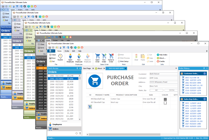
The Docking System acts as a replacement to PowerBuilder's traditional MDI frame window. It gives users a tabbed interface to navigate between open windows. Additionally, it allows you to dock and pin commonly used functions to the top, bottom, left, or right sides of the window.
Other features include:
- Floating document tabs.
- Dynamically change a dock panels size and pinned\unpinned state.
- Trigger events on the active document or all documents.
- Use traditional MDI instead of the tabbed document interface.
Tile Menu
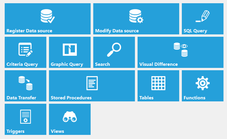
PowerTiles is a Windows tiles control that can be used for better navigation within your application. The design is responsive which means the layout will adjust to the size of the container that it's in (when resized by the container).
Use this control to quickly present users with core options and functionality available in your application.
More Controls
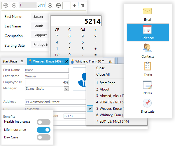
Here are some of the controls available to you:
- Tile Menu - Responsive Windows tiles control that can be used for better navigation within your application
- PowerToast - Display toast notifications on the desktop to alert users to something that requires their attention.
- Windows 10 Message
- DW Navigator - Simple strip of buttons used to navigate the rows of your datawindow.
- Calculator - A responsive calculator control.
- Tab Control - Replace your old PowerBuilder tab control with the USPB tab control to give your applications an instant facelift.
- Toggle Button - A button with two states, on or off.
- Toolbar - Place a toolbar on any of your windows or userobjects.
- Property Grid - Display a list of properties and values. Choose from many property types such as Image, Color, Lists, and Checkboxes.
- Query Builder - A graphical SQL generator much like the one found in the Datawindow.
- XP Header - Visually appealing way to display title text with images.
Built In Themes and Styles
Ultimate Suite for PowerBuilder Pre-built color themes include: Blue, Silver, Grey, Windows 10 Black, Windows 10 Blue, Windows 10 Olive, Windows 10 Silver, Blue, Black, Classic, Olive, Silver.
Each control can use one of the predefined themes in Ultimate Suite for PowerBuilder. Choose from a wide range of styles and colors.
You can also customize many of individual controls with their own styles to design a unique user interface for your PowerBuilder applications.
