Modernize your PowerBuilder Applications
Ultimate Suite for PowerBuilder
PowerBuilder Command Button
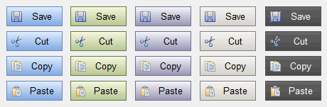
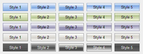
This control offers 5 styles, and 5 themes.
That's 25 different ways to display your buttons.
When you place this command button on your window, you'll see that in the IDE it appears as a normal PowerBuilder command button. However, you'll notice that you now have a few extra properties that you can set.
- TipText - Allows you to add tip text to the button.
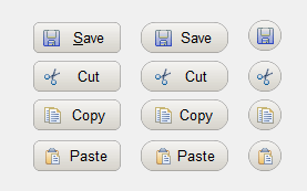
- VisualStyle - Default is 1 (see image below), valid values are 1-5. Try them out to see which one you like best.
- Ellipsis - If the text is too long for the button, an ellipsis will appear.
- Theme - Default is Classic, valid options are BLUE, SILVER, OLIVE, CLASSIC, and BLACK.
- IconName - This can be an image file or a PB icon (e.g. Save!).
- HTextAlign - Default is Center!, valid options are Left!, Center!, and Right!
- CornerRadius - Specifies the amount of corner radius to apply to the button.
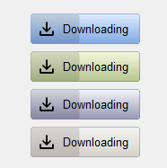
- PercentComplete - Displays shading over the button to indicate progress.